What is
a contact form
and how do they work?
In this guide on what is a contact form and how do they work, we'll cover the following topics:
- What is a contact form?
- Why is a contact form used?
- What makes a good contact form?
- How a contact form works
So, what is a contact form?
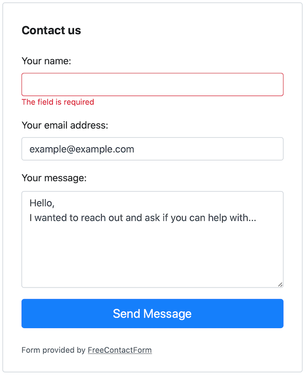
Here are three different ways to quickly describe what a contact form is.

Why is a contact form used?
Almost all websites want to provide at least one method to allow visitors to get in touch with them. The most common options they provide are physical addresses, telephone numbers, social media links (Facebook, Twitter, Instagram, etc), email addresses, online chat with an advisor, online chat with a robot, and a contact form.
Visitors can often have many options available to contact the people behind the website. Sometimes a phone number is the best option if they need real-time assistance, or social media if they what the communication to be public. Other times they may physically want to visit the place of business, so the address is perfect. However, often a contact form is used when none of the other communication methods are possible, available, or appropriate.
From the website users' point of view, a contact form allows them to provide details which they may find harder to explain over a phone, or they may feel more comfortable writing than talking. Often phone numbers are busy or closed, so sending a message through a contact form is quick and easy.
From a website owners' point of view, a contact form allows them to require enough information (for example, their name, email address, and reason for contact) to deal with the message. It also allows for a digital paper trail and future potential marketing.
What makes a good contact form
There are many different views of what makes a good contact form. In my opinion, based on many years of design, user experience, web development, and research, a good form should meet the following points:
Easy to understand and use
It seems obvious, but it’s often the most overlooked part of a contact form. Often a contact form is created with either too much focus on the business purpose or the personal creative preferences of a designer. First and foremost, a contact form should be designed to meet the business needs, but a real effort should be placed on making it as easy as possible for the user. This means that jargon should be used carefully, and the presentation should be practical.
Only require information which is needed
How many times have you filled in a contact form when they force you to provide personal details like address or mobile phone number when you do not feel it’s needed. Sometimes it will put people off and they will leave. That could be a lost potential customer.
Think very carefully about what information you need. If you want to, you can include additional “optional” fields which lets the user decide how much information they want to share.
Make sure it works
That sounds stupid, right? Have you ever completed a contact form only to find out it doesn’t work properly? There could be a bug that doesn’t accept your email address format, or it may require a data you don't have or worst of all, it may submit and come back with a nasty error message.
It’s a good idea to regularly test your forms to make sure they still work. Something may have changed with your hosting environment or mailer server which stops them from functioning properly.
How a contact form works
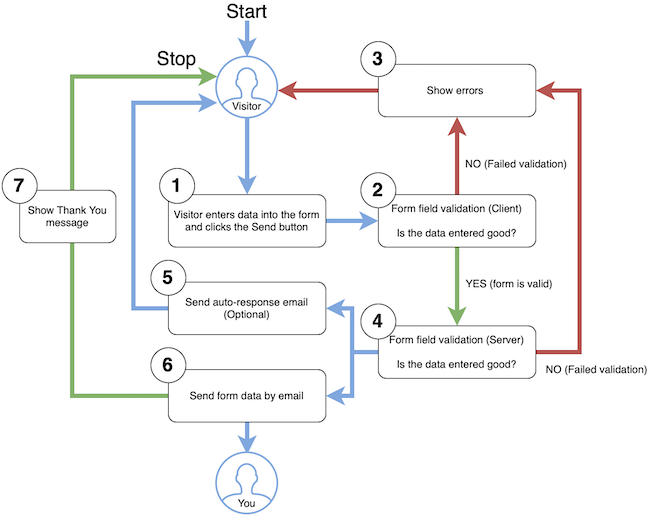
Here's a diagram highlighting the main processes involved during visitor interactions with a contact form.

Let's go through each step.
1. The user enters data into the contact form and clicks the send button
2. Form field validation is triggered on the client-side (in the user's browser)
One of two things can now happen. Either the data entered was validated successfully or it failed validation. Let's assume it failed validation first (go to step 3).
3. Show the error to the user

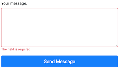
An error message is shown in red text under each of the fields which failed validation. The message will indicate why the validation failed. The user now needs to fix the error and send the form again (go to step 2 again). Now let's assume they get it correct this time and the validation is successful. Go to the next step.
4. Form field validation is triggered on the server-side
The server now does a final validation check. If anything fails, a message is sent back to the user (step 3). If the validation is successful, carry on to steps 5 and 6.
Although not shown explicitly in the diagram, if reCAPTCHA is used, then that validation will also be included at this stage.
5. Send auto-response email (optional, available in Contact Form Pro)
If this option is enabled and used, an email is created and sent to the visitor's email address.
6. Send form data by email
The data which was entered into the form is used to create and email which is then sent to you.
7. Show the Thank You message

The form is now hidden and a thank you message is shown for the visitor.